Zarbee’s Key Visual Evolution
Design Strategy · Creative Direction · US Brand Expression
A refreshed visual system that re-established Zarbee's warm, optimistic tone in the US market and created a scalable foundation for future global expansion across print, retail, and digital touchpoints
The Challenge
IDENTIFYING THE OPPORTUNITY
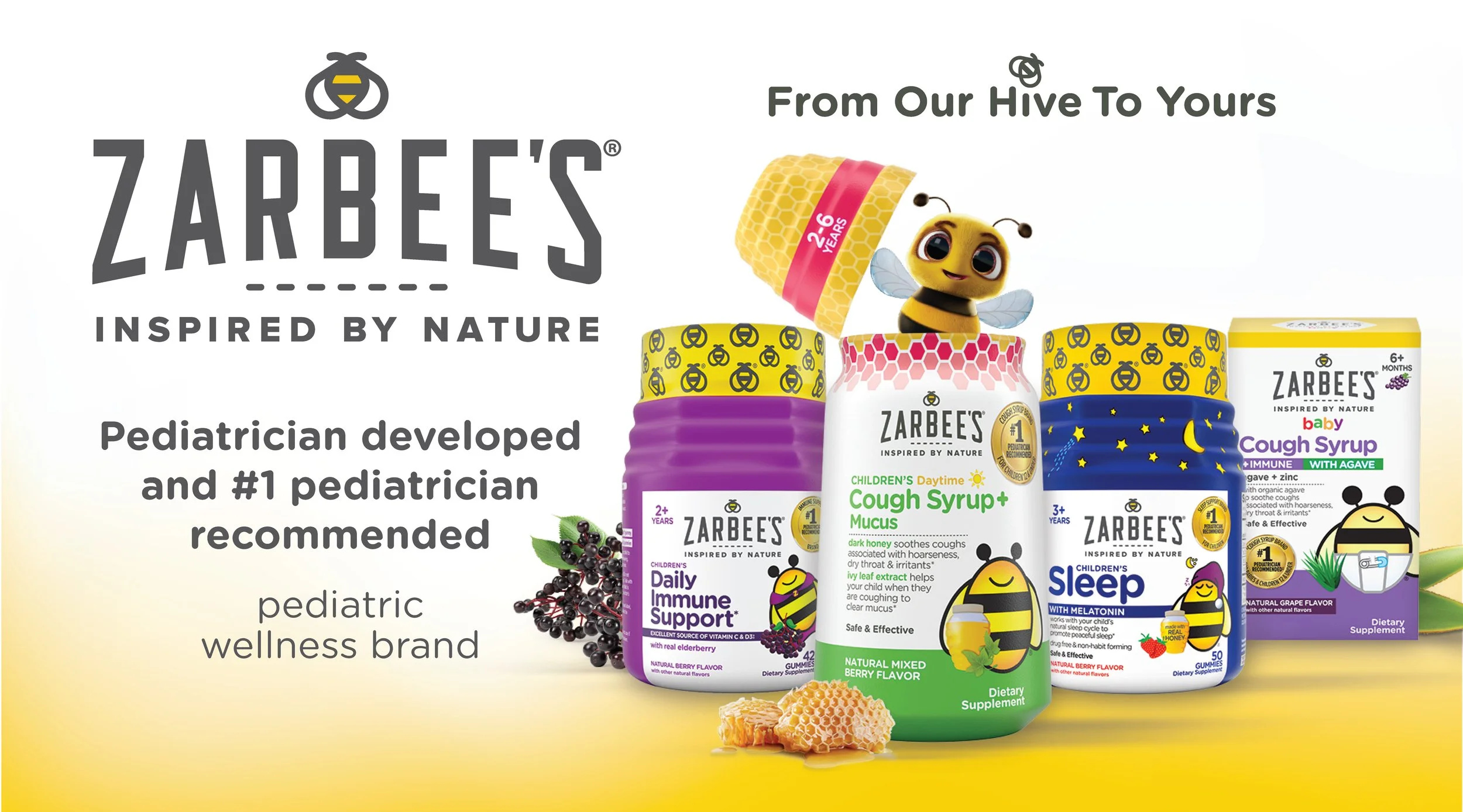
Zarbee's US key visuals had gradually moved away from the brand's intended tone - warm, nature-led, and uplifting. The backgrounds had become increasingly dark and heavy, weakening brand clarity and reducing the emotional connection that customers expected
This shift was making it harder for the brand to stand out and resonate with families seeking natural wellness solutions
DRIFTING AWAY FROM BRAND
Recognition
I identified that visual tone was misaligned with brand positioning and consumer expectations for a natural, trustworthy wellness brand
Strategic Proposal
I raised concern with Head of US Marketing, presenting the case for visual evolution to restore brand warmth and clarity
Green Light
I received invitation to explore new background systems and visual expressions that could elevate the brand across all touchpoints
Scope Definition
I defined the goal: evolve US key visuals into a brighter, more strategic system supporting brand equities and future global adaptation
The Solution
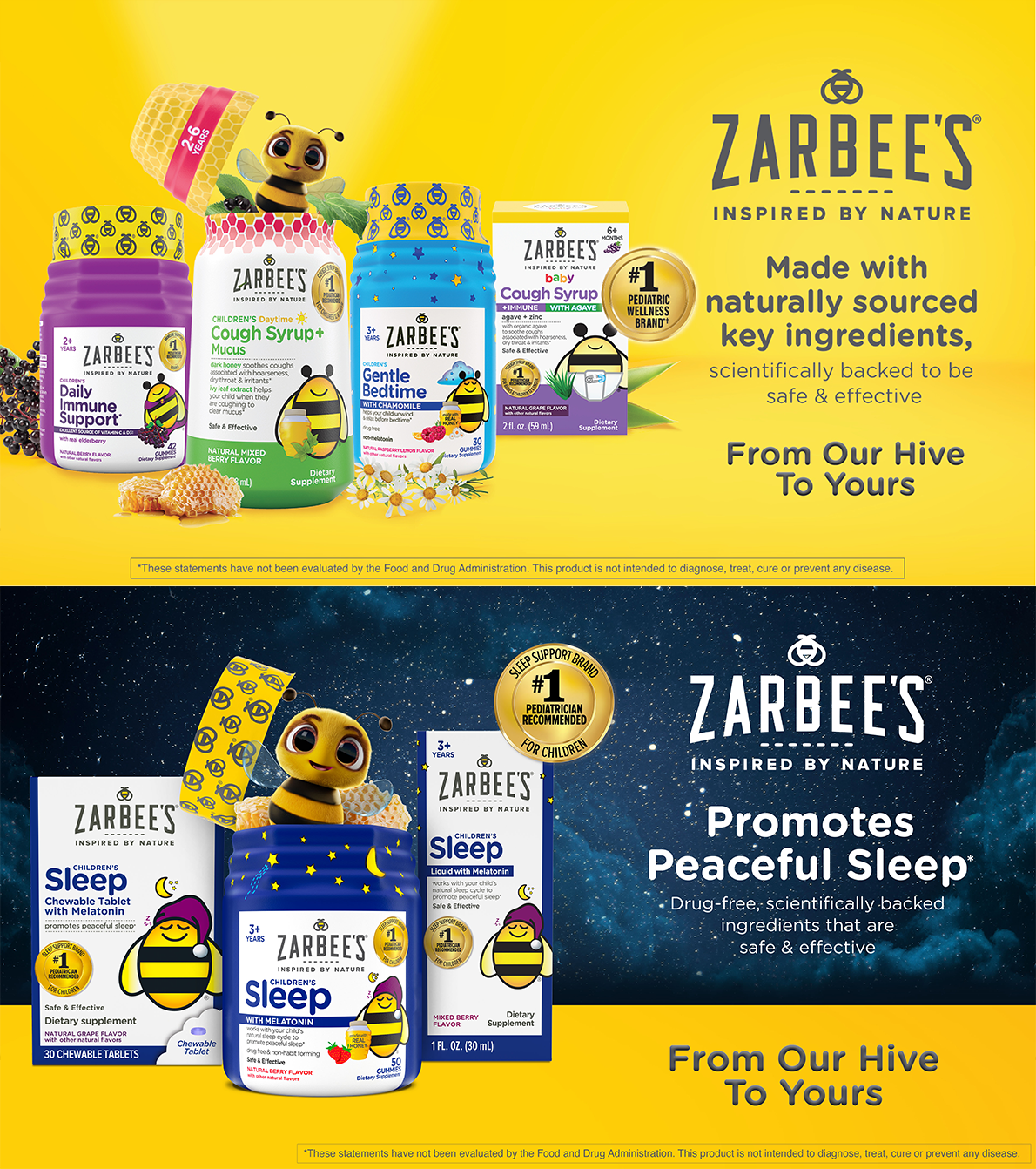
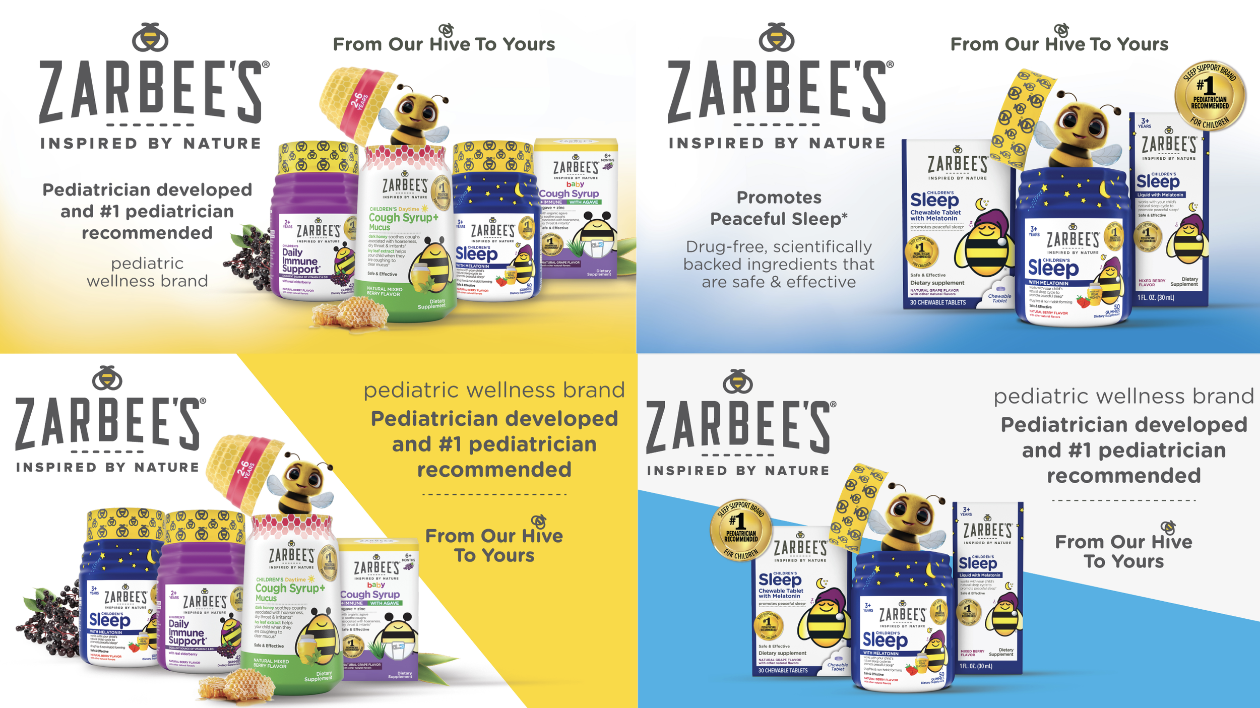
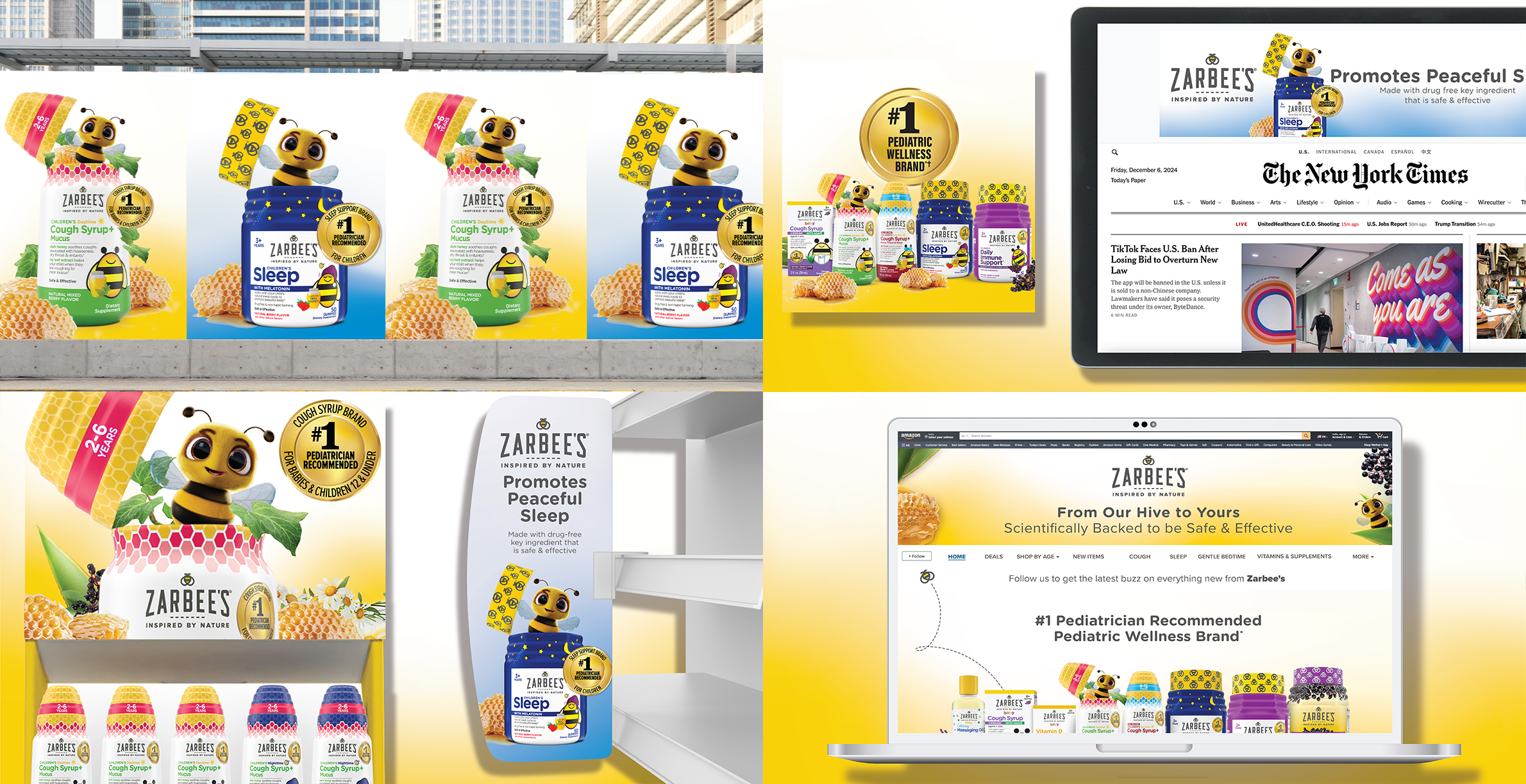
I developed a series of new background territories grounded in lightness, clarity, and nature-inspired warmth. Through multiple rounds of creative exploration, I crafted distinct visual worlds that reinforced Zarbee's authentic tone of voice while dramatically improving visibility and storytelling capabilities
01. Lightness
Brighter backgrounds that celebrate natural ingredients and create an inviting, optimistic mood
02. Clarity
Improved visual hierarchy and communication structure across all consumer touchpoints
03. Nature-Inspired
Authentic warmth rooted in honey, botanicals, and natural wellness storytelling
STRATEGIC TESTING
Working closely with marketing and CBI, we narrowed the exploration to two strong visual directions. Each territory represented a distinct approach to expressing Zarbee's brand values while maintaining commercial viability
We validated both directions through rigorous Brainsuit testings to understand which visual system best supported core brand attributes and delivered strongest performance in emotional engagement and consumer attention
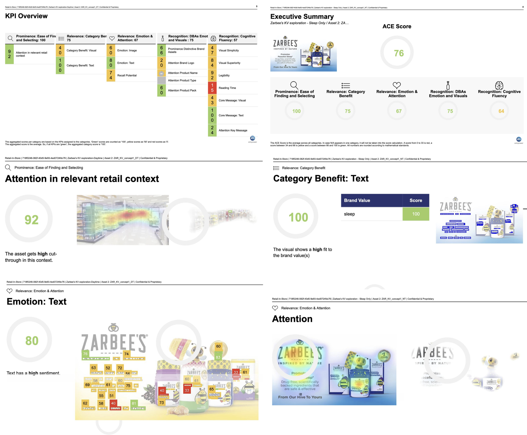
VALIDATED RESULTS
01. Core Attributes
Testing confirmed which visual territory best reinforced "safe," "natural," and "trusted", the essential pillars of Zarbee's brand promise to families
02. Emotional Resonance
Testing revealed significantly higher emotional engagement scores with the brighter, nature-forward visual system
03. Attention Performance
The selected direction demonstrated superior ability to capture and hold consumer attention across retail and digital environments
The Impact
The new key visuals introduced a brighter, more inviting US brand expression. The refreshed background system strengthened brand recognition, reinforced emotional warmth, and dramatically improved communication clarity
100%
Brand Alignment
Restored authentic tone
BUILDING A SCALABLE SYSTEM
US Foundation
Established core visual and background system for immediate US market application
Flexible Framework
Created adaptable structure allowing for regional nuance while maintaining brand cohesion
Global Ready
Designed with scalability for future international markets when expansion becomes relevant
Project Team
US Marketing Team · CBI Team · Design Team