Dove Men+Care Oil Control Visual System
Key Visual Development · Visual System Design · Digital Applications · POS & In-Store
A performance-driven visual system that translates Oil Control into unified, scalable brand expression
The Challenge
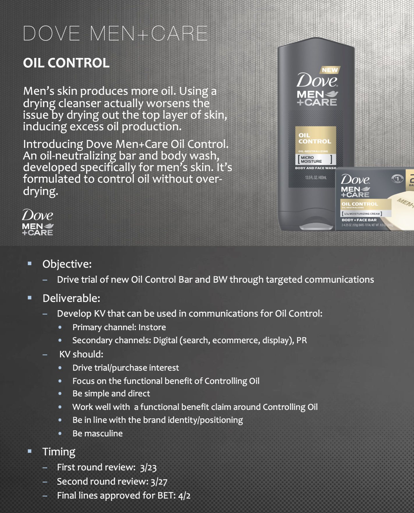
Dove Men+Care needed clarity. The Oil Control benefit required immediate visual communication. Performance had to read instantly
The brand's masculine, functional aesthetic couldn't be compromised. Print, retail, digital, and e-commerce all needed consistency
A Key Visual was essential. A scalable design system that flexed across formats and markets without losing impact
STRATEGIC FOUNDATION
Clear Communication
Oil control message had to land instantly across all consumer touchpoints and channels
Brand Consistency
Masculine, functional aesthetic maintained throughout every market and format variation
Scalable System
Design framework flexible enough for global execution while preserving core visual identity
The Solution
STRATEGIC FOUNDATION
01. Strategy Definition
Established performance-led framework grounded in Oil Control's core functional benefit and masculine brand positioning
02. Visual Language
Developed clean, bold aesthetic that translated protection and care into immediate visual understanding
03. Photo Art Direction
Led full concepting and execution to create authentic masculine imagery aligned with brand tone
04. System Scalability
Built flexible design architecture ensuring consistent application across all touchpoints and markets globally
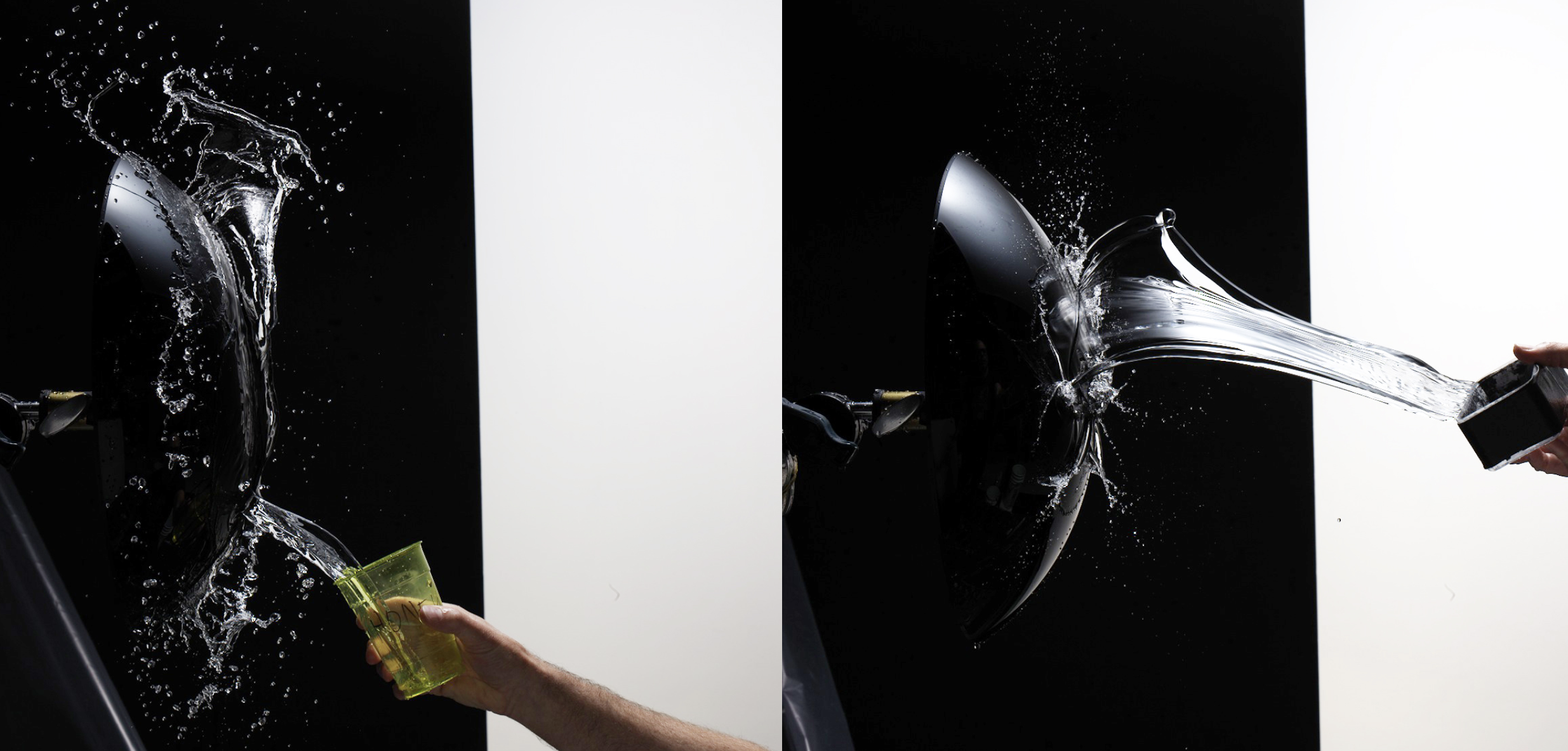
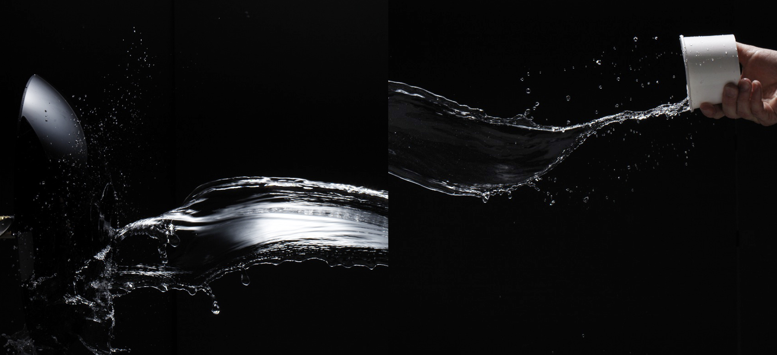
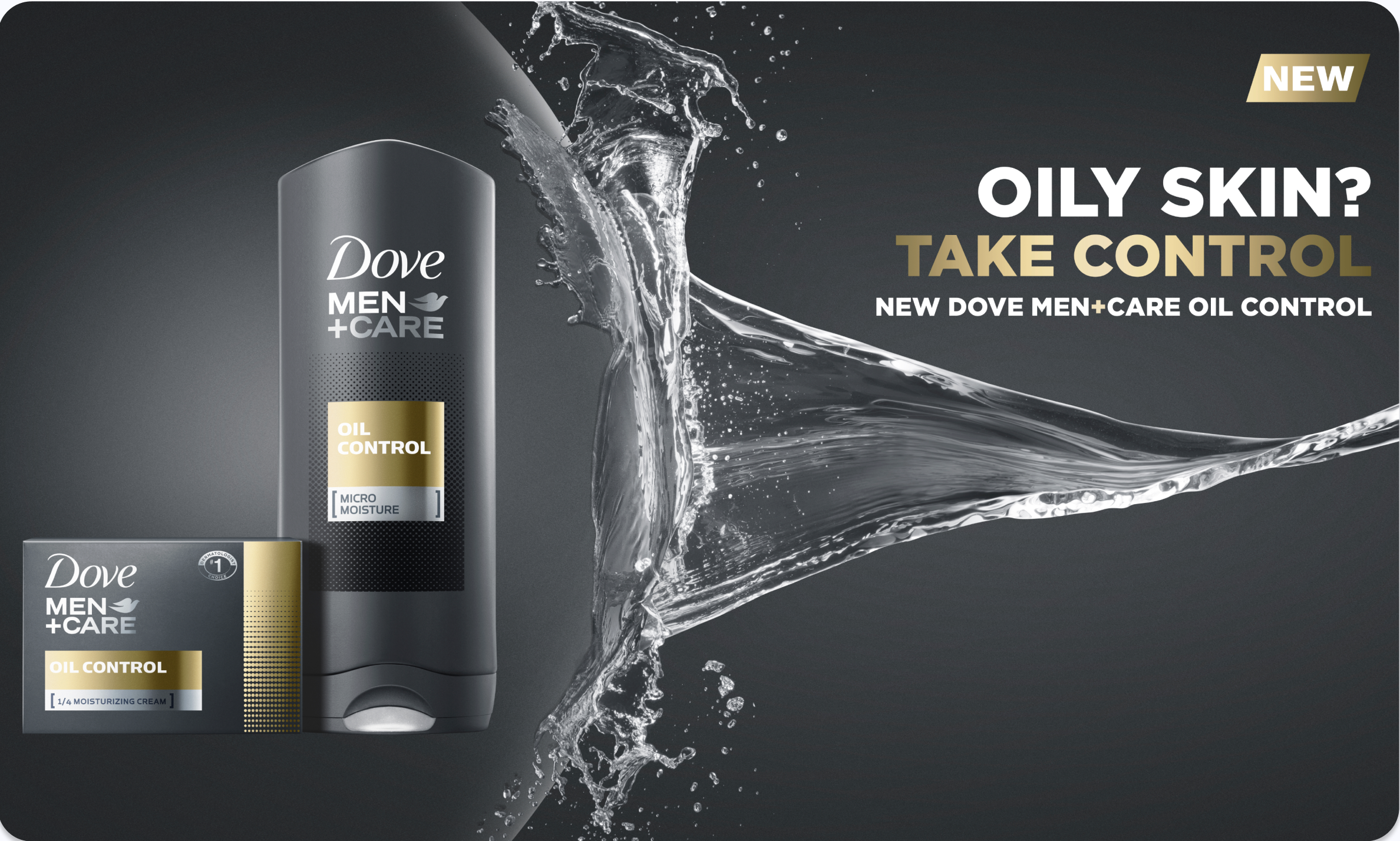
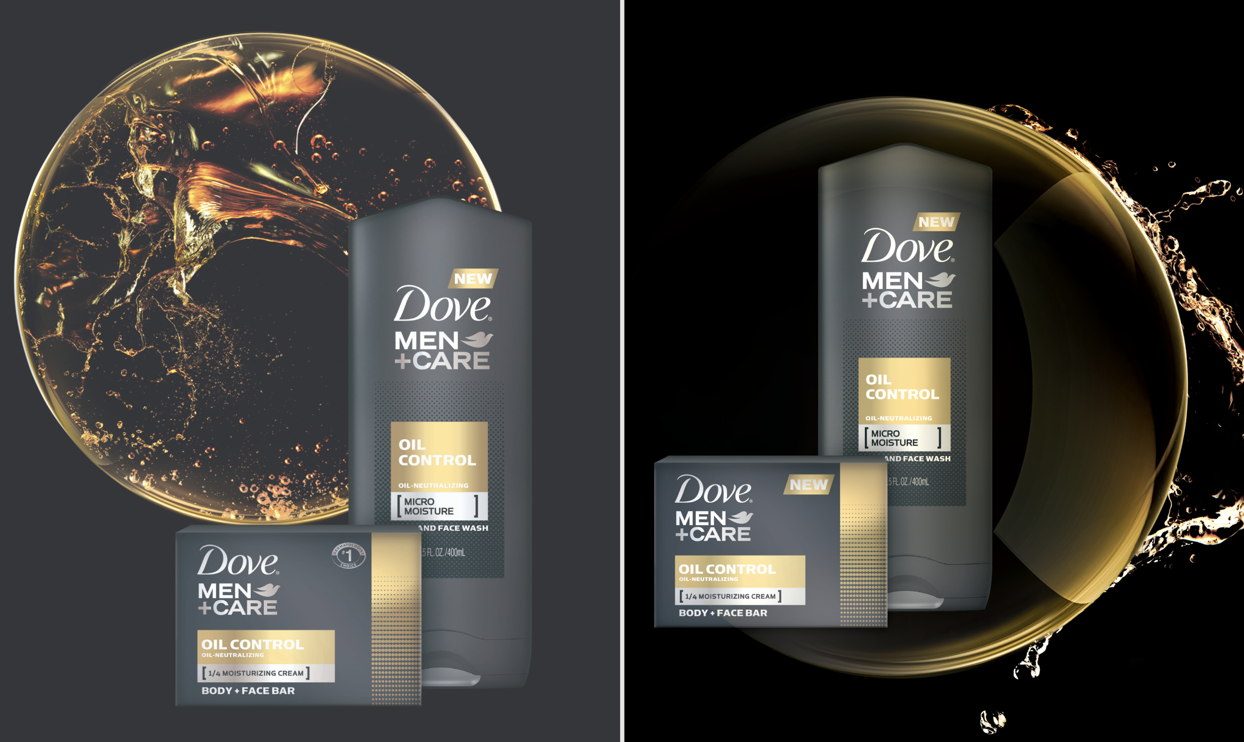
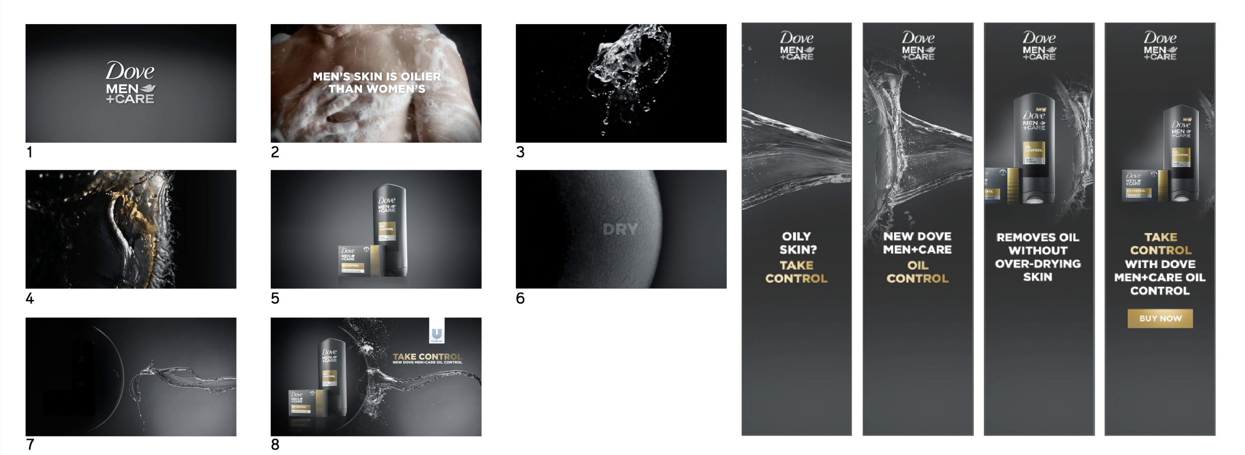
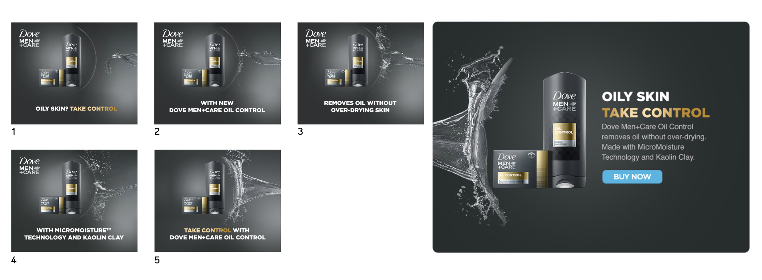
The Key Visual became the foundation of the system, using photography that showed protection in action - fresh skin, controlled oil, and maintained comfort, ensuring every element communicated the benefit instantly with no confusion or mixed messages
DESIGN SYSTEM FRAMEWORK
Key Visual Architecture
Unified hero imagery system translating Oil Control benefit through protective care narrative and bold composition
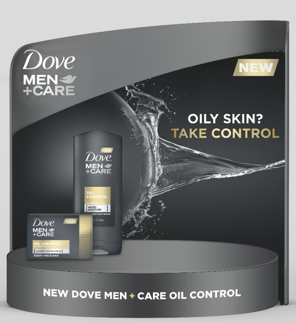
Touchpoint Flexibility
Scalable templates adapting seamlessly from print retail displays to digital e-commerce and social media
Brand Consistency
Masculine visual language maintaining Dove Men+Care aesthetic across all markets and format variations
The Impact
Global Consistency
Unified expression across all touchpoints. Every market speaking the same visual language
Functional Clarity
Stronger storytelling around core benefit. Oil control without drying communicated instantly
Brand Reinforcement
Masculine, performance-led DNA maintained. Authentic to Dove Men+Care identity
Project Team
Global Marketing
Collaborators
Photography Studio Partner